
Look at the corner behind your front door. Right now, it's probably holding a pile of shoes, a leaning umbrella, and a bag you keep forgetting to move. That corner is dead space — and in an apartment under 45 square meters, dead space is the whole problem.
I've spent the last few years helping friends and clients squeeze livable rooms out of places that shouldn't be livable. A 28-square-meter studio in Lyon. A two-bedroom where the "dining area" was a hallway. The fix was almost never buying more furniture. It was reading the geometry of the room correctly — the corners, the heights, the negative space — instead of decorating the surfaces everyone sees.
Here's what actually works, and the rules that explain why.
Key Takeaways
- The 3-5-7 rule governs how many objects and heights you stack in a corner group — not the number of decorative items you sprinkle around.
- The 70/30 rule splits your palette into 70% neutral base and 30% accent. In small rooms, that 30% should live where you want the eye to rest, not everywhere.
- Corners fail for one reason: they're treated as storage instead of sightlines. Fix the sightline first.
- A 90° corner can hold a plant, a floor lamp, a stool, or a shelf — but rarely a full piece of furniture without killing circulation.
- Vertical thinking beats horizontal thinking in every room under 50 square meters.
Small space interior design starts with three rules most people never name
Designers use ratios as shortcuts. They compress dozens of decisions into one number so the room doesn't collapse into visual noise. Three of them matter for small rooms, and almost nobody explains them plainly.
What is the 3-5-7 rule in interior design?
The 3-5-7 rule is a styling guideline: group decorative objects in odd numbers — three, five, or seven — and vary their heights so the eye reads a triangle rather than a flat line. Three items of one height look like a shelf of leftovers. Three items at three different heights look intentional.
In a small space, this rule matters more than in a big one. On a narrow console table, a trio of objects at staggered heights (a tall vase, a mid candle, a low stack of books) fills the surface without crowding it. Five is right for a wider sideboard. Seven is for open shelving where you want rhythm across the whole wall.
The reason odd numbers work: your eye can't split them into two symmetrical halves, so it keeps moving. Even numbers make the brain file the composition as "done" and move on. In a 12-square-meter living room, keeping the eye moving is the entire job.
What is the 70/30 rule in design?
Divide any palette into 70% dominant tone, 30% secondary or accent. That's it. Walls, large furniture, and floor coverings take the 70. Cushions, throws, artwork, and one statement object take the 30.
What most people get wrong in small rooms is spreading the accent color across five surfaces. The corner that should feel like a destination becomes a shouting match. I repainted a client's studio after she'd used a deep terracotta on the sofa, the curtains, and the kitchen backsplash. The room looked 3 square meters smaller than it was. We kept the sofa and cut everything else to a warm off-white. Same furniture, different size.
The 70/30 split also applies to empty space versus filled space. In a small room, aim for roughly 70% visible surfaces and 30% covered. When shelves are packed edge to edge, the wall stops reading as a wall and starts reading as clutter.
The rule nobody names
Corners need a vertical anchor. A bare corner forces the eye to the ceiling, which is where all the awkward space lives in a small room. Drop something tall into that angle — a slim floor lamp, a tall plant, a narrow ladder shelf — and the corner stops being a void. It becomes a column.
How to actually use a 90° corner
Every corner is a triangle waiting to happen. The problem is that rectangular furniture doesn't fit triangles, so people shove a rectangular cabinet in, leave 20 centimeters of unusable gap, and call the corner full.
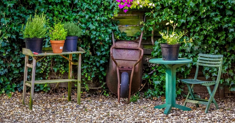
Corners are the cheapest square meters you own. Here's how to claim them.
- Corner shelves that wrap. A five-tier corner unit uses the angle itself instead of fighting it. Choose one with a small footprint (around 30–40 cm per side) so it doesn't eat the walkway.
- Under-stair or under-shelf angles. If your staircase or a built-in bench creates a low triangular void, that's where baskets and closed storage go — not display items you want to look at.
- The door-swing corner. Measure how far the door opens. If it clears 60 cm, you can place a narrow stool or plant there. If it clears 80 cm, a slim desk fits.
- Behind-the-door strip. A 15 cm-deep wall behind a door holds hooks, a shallow shelf, a mirror. Nothing deeper, or the door won't open.
- The ceiling corner. Hanging a plant or pendant light in the upper angle draws the eye up and makes the ceiling feel taller than it is.
One warning from experience: corner furniture that looks tidy in a showroom can box in a small room badly. I installed a corner sofa in a 16-square-meter living room and immediately regretted it. It filled the angle beautifully and destroyed every walking path. I swapped it for a two-seater against the long wall and never missed the corner. Corners are for vertical storage and light, not for seating.
Decorating ideas for a small corner space
A corner doesn't need to become a functional zone. Sometimes it just needs to stop looking abandoned. There's a real difference between a corner used for storage and a corner composed as a small moment.
The three-light corner
Stack three light sources at different heights in one corner: a floor lamp at 150 cm, a table lamp on a small side table at 60 cm, and a candle or clip light lower down. The layering creates a soft vertical glow that reads as designed rather than lit. It costs almost nothing if you already own two lamps.
The reading nook that isn't furniture
You don't need a chair to make a nook. A cushion on a low platform, a wall-mounted swing-arm lamp, and a small side table the size of a dinner plate is enough. The trick is the light source being fixed to the wall so nothing sits on the floor. Floor objects are what make small corners feel cramped.
The display corner
Choose one object you actually love — a print, a sculpture, a framed photo — and give it the whole angle. A single spotlight, a narrow floating shelf, and the object. That's it. Empty wall around it makes the object bigger. This is the 70/30 rule applied at the scale of a single corner.
Small space design ideas that do the heavy lifting
Once the corners are handled, the rest of the room gets easier. These are the moves that consistently change how a small room feels, ranked by how much they return on the effort.
| Move | Best for | Typical cost | Impact |
|---|---|---|---|
| Vertical shelving to the ceiling | Any wall with unused height | Low to mid | High |
| One large rug instead of two small ones | Open-plan studios | Mid | High |
| Wall-mounted lighting (no floor lamps) | Narrow rooms under 3 m wide | Mid | Medium |
| Mirror on the shortest wall | Rooms with one dark side | Low | Medium |
| Multifunction furniture (storage ottoman, fold-down desk) | Studios, one-room living | Mid to high | High |
| Repainting the dominant 70% to a light neutral | Any room that feels tight | Low | High |
The rug point deserves a note. Two small rugs chop a room into two small rooms. One rug that reaches under at least the front legs of your main seating pulls the whole area together, and the floor reads as continuous. I've seen this single change do more for a studio than any furniture swap.
Low budget small house interior design
You don't need to spend much to reshape a small room. The highest-return, lowest-cost moves are paint, lighting placement, and removing things. Repaint the dominant surfaces to a single warm neutral. Move your light sources off the floor and onto walls. Take out one piece of furniture for a week and see if you miss it. In my experience, people miss almost nothing they remove — and they notice the extra floor immediately.
If you have a little budget, spend it in this order: better lighting first, a proper rug second, storage furniture third. Skip the decorative objects entirely until the bones work.
Making a small room look bigger
Before-and-after photos of small rooms hide the real variable. It's rarely the furniture. It's the number of visual stops — the points where the eye pauses and resets.
Count them in your room right now. Every mismatched cushion, every exposed cable, every small object on a surface is a stop. A room with twenty stops feels crowded even when it's empty. A room with five feels spacious even when it's full.
So the process is subtraction before addition:
- Clear every horizontal surface completely.
- Remove anything on the floor that isn't furniture — bags, boxes, loose shoes, cables.
- Give every remaining object one permanent home, ideally with a door on it.
- Then add back only what earns its place — and apply the 70/30 split to what you keep.
The result isn't minimalism for its own sake. It's a room where the eye has somewhere to settle instead of bouncing around. That calm reads as space.
What this all comes down to
Small rooms aren't solved by clever products. They're solved by deciding what each corner is for before you put anything in it. Storage, light, display, or nothing at all — four honest answers, and "nothing at all" is often the correct one.
The next time you walk past that dead corner behind the door, don't reach for a shelf. Stand in the doorway, look at the whole room, and ask where your eye wants to rest. Then put something tall there. That's the entire method, and it works in a 20-square-meter studio and a 45-square-meter two-bedroom alike. The corner you can't figure out is usually the one you're trying to fill too much.


