Open concept living: how to define zones without walls
A client once told me her open-plan living area felt like "a hotel lobby where everyone lives." Sofa floating in the middle of nowhere, dining table competing with the kitchen island, a TV console visible from the front door. The room was 52 square meters. It read as one undifferentiated slab of beige.
We fixed it in a weekend. No contractor, no permit, no wall. Just rugs, lighting, and one strategic piece of furniture. That's the thing about open concept living: the problem is almost never square footage. It's the absence of cues. Your brain needs signals to know where one activity ends and another begins, and walls are only the crudest version of that signal.
Here's what actually works, what I got wrong for years, and the numbers I now use on every project.
Key Takeaways
- The average open-plan room needs three distinct cues per zone to feel defined: a floor anchor, a lighting temperature shift, and a furniture boundary.
- Floating a sofa 16 to 24 inches off the wall works — but only if you have at least 36 inches of walkway behind it. Less, and the room feels cramped, not zoned.
- Rugs are your cheapest tool and your most common mistake: a rug that doesn't overlap the furniture it's meant to anchor creates visual noise.
- Lighting temperature does more zoning work than furniture. 2700K for lounging, 3000K for dining, 4000K for task areas is the rough map I follow.
- Acoustics are the forgotten zone divider. Nothing undoes a visual boundary faster than sound bouncing between two "separate" areas.
Why your open concept feels like one big room (and it's not the size)
Open plans fail for a predictable reason: the eye has nothing to stop on.
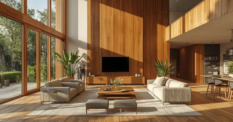
Think about how you read a wall. It gives you a hard edge, a shadow line, a change in material. Remove it, and your visual system keeps scanning until it hits something — usually the far wall of the kitchen. That's why guests always drift toward the same corner of an open room. There's no reason to stop anywhere else.
The sightline problem
Stand at your front door. Where does your eye land first? If the answer is "the refrigerator" or "the TV," you have a sightline problem, not a furniture problem. The fix is to interrupt that line with something at mid-height — a shelf, a plant on a console, a pendant light hanging low. Anything that forces the eye to pause before it reaches the back wall.
Which brings up something I ignored for years: you don't zone a room from above. You zone it from eye level and below.
The activity conflict nobody talks about
I made this mistake on my own apartment. I zoned the living area beautifully — rug, sofa facing a low bookshelf, warm lamp. Then I started working from the dining table three feet away. Within two weeks, the "living room" had become an office annex. Laptop cables on the rug. Headphones on the coffee table.
The visual boundary was fine. The usage boundary was fiction. If your zones serve activities that bleed into each other — work and rest, cooking and hosting — no rug will save you. You need a physical interruption, and I'll get to which ones actually work.
The floor is your first wall
Rugs do more zoning work than any other single element. They're also where most people get it wrong.
The rule I use: every piece of furniture in a zone should have at least its front legs on the rug. If a sofa's front legs are off the rug entirely, you've created two separate islands instead of one zone. If all four legs sit on it, the rug is too small and the room will feel pinched.
Rug sizing, in numbers
Forget the vague advice. Here's what I've landed on after enough failed layouts:
- Living zone: rug should extend 8–12 inches beyond the sofa on both sides and reach under the front legs of every chair.
- Dining zone: add 24 inches of rug on each side of the table, so chairs stay on it when pulled out.
- Transition paths: leave 36 inches of bare floor between two rugs. That gap is the "doorway" between zones.
- Circulation corridors: never narrower than 36 inches, ideally 42.
Material matters too, and this is where the zoning gets subtle. A flat-weave wool in the living area next to a chunkier jute under the dining table reads as two different rooms — even from across the space, even with zero furniture in between. The change in texture does the work a threshold would do.
Avoiding the rug conflict
One warning: adjacent rugs can fight. Two strong patterns side by side create visual noise that reads as "cluttered," not "zoned." Keep one rug quiet — solid, low-contrast, neutral — and let the other carry the pattern. In my own apartment, the living rug is a plain oatmeal flatweave; the dining rug has a faded geometric print. Nobody has ever described the result as busy.
If rugs aren't an option — toddlers, pets, a rental — painter's tape on the floor for a week is a legitimate prototyping tool. I've done it. It looks ridiculous and it saves you from a $600 mistake.
Furniture placement that creates invisible walls
Most people push furniture against walls. This is the single biggest mistake in open-plan layouts, and it's the reason rooms feel both empty and crowded at the same time.
Pull the sofa out. Float it. A sofa placed 16 to 24 inches off the wall — with a console or slim shelf behind it — instantly creates a boundary. The space behind becomes a walkway or a reading nook. The space in front becomes the living zone. You've made a wall out of 20 inches of air.
What goes behind the floating sofa
This is a real question and the answer depends on your room. Options that work:
- A narrow console table, 12–14 inches deep, with two lamps on it.
- A low bookshelf, no taller than 32 inches, so it doesn't block sightlines.
- Nothing at all — just the gap. Minimal, but it only reads as intentional if the sofa back is finished (upholstered, not raw).
- A row of tall plants if you want the boundary to feel softer and greener.
Taller than 36 inches and you start blocking light and conversation between zones. That's a wall, and you didn't want a wall.
Perpendicular arrangements beat parallel ones
If your sofa and dining table sit parallel to each other, they'll read as one long room forever. Rotate one 90 degrees. A dining table perpendicular to the sofa instantly claims its own territory. I've watched this single change transform a 40-square-meter open plan more than any paint color ever did.
The same logic applies to kitchen islands. An island parallel to the sofa is a second coffee table. An island perpendicular to it is a kitchen.
Lighting: the zone divider you can't see but always feel
Here's a claim I'll defend hard: lighting zones do more for open-plan definition than furniture, and cost less.
In a space with one ceiling fixture, every square meter reads identically. Add three light sources at different heights and temperatures, and the room splits itself. Your eye and your body both register the change — warm light says "sit down," cool light says "work."
| Zone | Color temperature | Fixture height | Why it works |
|---|---|---|---|
| Living / lounging | 2700K | Table lamps, 20–24 in | Low, warm light pulls you down into the seat |
| Dining | 3000K | Pendant, 30–36 in above table | Focused pool of light claims the table as its own |
| Kitchen task | 4000K | Under-cabinet, 36 in above counter | Cool light reads as functional, separate |
| Reading nook | 2700K, directional | Floor lamp, 48–60 in | Beam creates a private pocket inside the room |
Notice what's missing: a single overhead light. If you only change one thing after reading this, kill the central fixture. Put it on a dimmer if you can't remove it, and never use it alone.
Do you really need dimmers everywhere?
No. You need separate switches per zone. Dimmers are a bonus. The point is that turning on the dining pendant shouldn't flood the living area with light. If every fixture shares one switch, you have one room and no amount of furniture will change that.
The part almost nobody mentions: sound and escape
Visual zoning is the easy half. The hard half is acoustic zoning, and it's the reason open-plan homes feel exhausting after a few months.
Sound doesn't respect rugs. A conversation at the dining table carries straight into the living area, and if someone is on a video call at the kitchen island, the whole room is on that call. I've had clients describe this as "never being off." They weren't wrong.
Acoustic separation without a wall
- A tall bookshelf packed with books is the best acoustic buffer you can buy for the money. Irregular surfaces break up sound.
- Heavy curtains across a wide opening absorb more than you'd expect, and they slide out of the way when you want openness.
- A felt or wool wall hanging on the largest blank surface reduces echo noticeably.
- Plants help, but far less than people claim. They're a visual divider first, acoustic second.
And then there's the escape problem. If your open plan has no door anywhere, you've built a space where nobody can be alone. This is a real design failure in small homes, and I'd argue it matters more than aesthetics. A single sliding door to one corner — even a glass one — restores the option of privacy without closing the room.
When open concept stops being the right answer
Spoiler: sometimes it isn't.
Open plans work when the people in them want to be together — families with young kids, couples who cook and talk, hosts who like the kitchen at the center of a party. They fail when the household has conflicting schedules or conflicting noise levels. Two people, one working from home full-time and one on night shifts, in 45 square meters with no doors? That's not a design challenge. That's a design mistake.
In those cases, the honest answer is a partial wall, a glass partition, or a room that closes. No amount of clever rug placement fixes a fundamental mismatch between how a space is built and how it's actually used.
What I've learned, after more failed layouts than I'd like to count, is that zoning is less about making a room look divided and more about making it usable by the people in it. The rug, the lamps, the floating sofa — those are just tools. The real question is simpler: when someone walks in, do they know where to go? If the answer is yes, you've done it. If the answer is still "everywhere and nowhere," go back to the floor. Start there. Everything else follows.